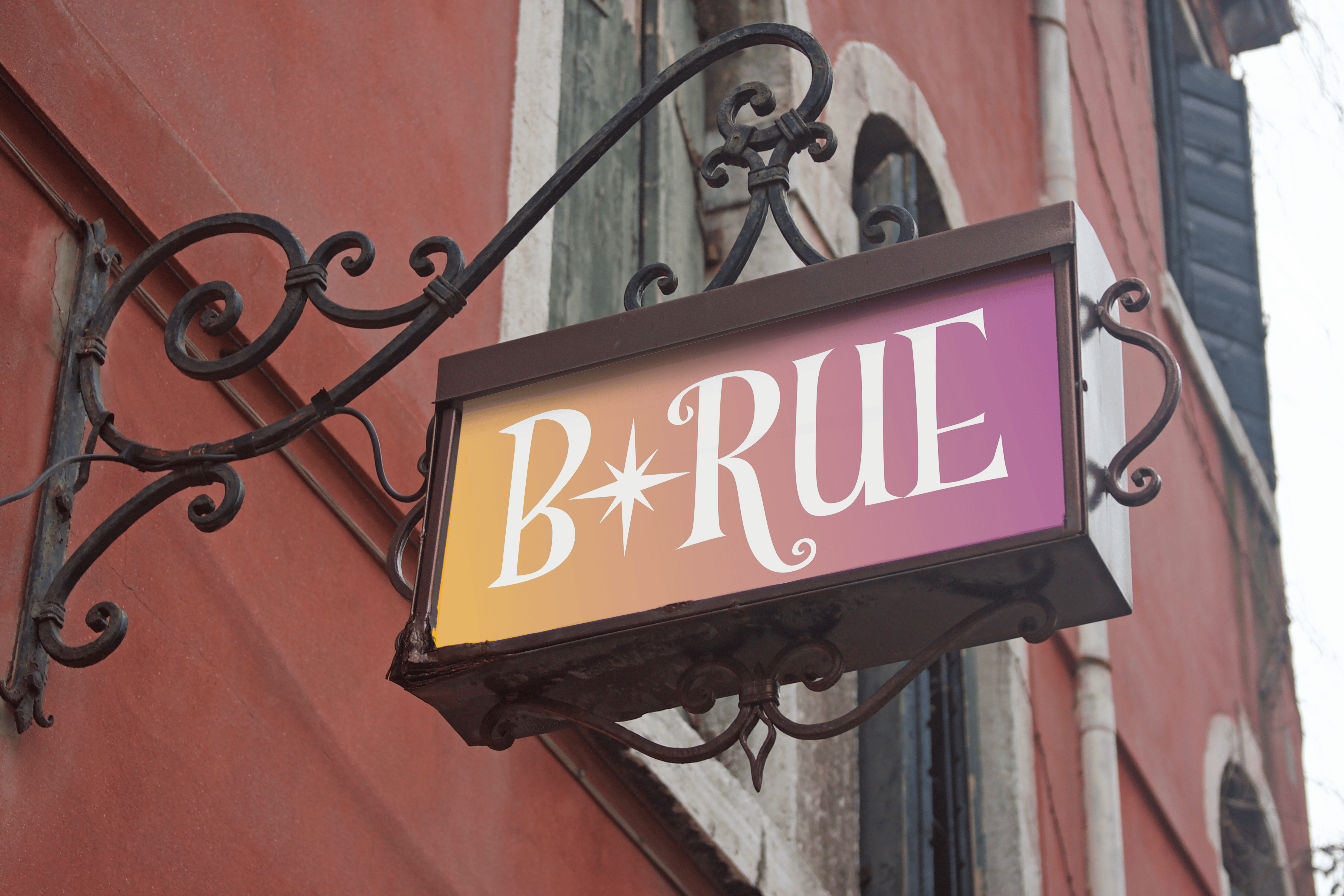
B*Rue-a creole restaurant inspired by New Orleans and Bourbon Street. The “B” represents Bourbon and “Rue” translates from French to street.
01
Drafting
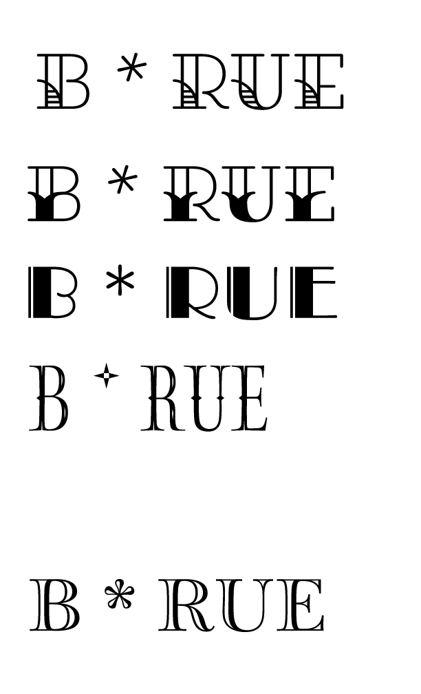
When I began developing the logo for B*Rue, I decided to hand draw what I wanted it to look like. At first I wanted to stick with the hand lettered typography. After receiving feedback, I decided that choosing a type that still reflected the feeling and theme I wanted to portray would make for a cleaner logo.
02
Revisions
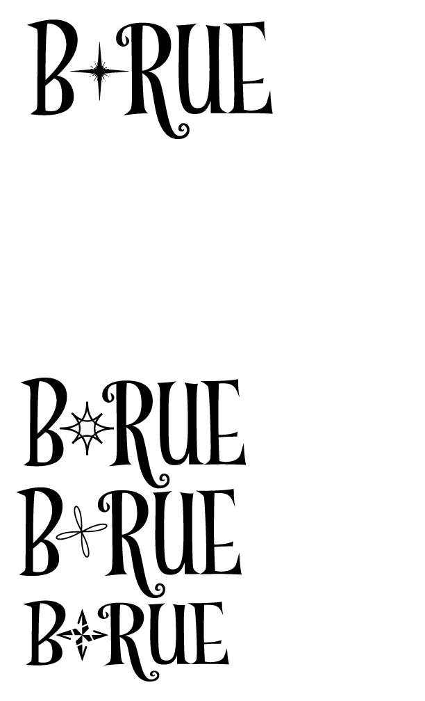
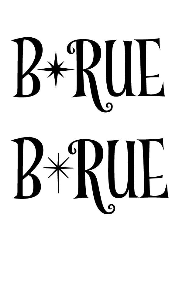
Implementing that feedback, after trial and error with several fonts for both the text and the star, I finally made my decision for what fit my theme the best.